
Digital typography is a natural phase in the development of writing that has been going on for centuries. Even if at the beginning the technique of arranging type was something that had a pure utility function, it became a part of visual art over time. Choosing the right fonts, the size of the letters, and the space between them are the challenges that every creator of texts, magazines, or websites must face. All of this is to provide people with the pleasure of reading at the highest possible level while maintaining the principles of usability, convenience, and uniqueness of the content. This article has been written to help you achieve these goals.
In the beginning there was the word. Or a letter, in fact. Or actually, it was the typeface. Johannes Gutenberg – does that ring a bell for you? The moment he invented the mechanical movable-type printing press is considered by Europeans to be the beginning of the printing era.
That was the time when it all started.
There was a boom in printing along with creating new characters, designing typefaces, and layouts. Over the years, typography has entered every aspect of our lives, and now (although you probably don’t pay attention to it) it’s absolutely everywhere and surrounds us from every angle of daily life. Don’t believe it?
Look at your books and their spines with the titles; open your kitchen cupboard and peek at the product names on their boxes; dig at the name of your fridge inscribed on its door; enter the shopping center and focus on the names put at the shops’ entrances. Do you already know what I’m talking about?
Today, apart from the traditional typography used in print, its digital counterpart has an equally important place in designing and preparing publications.
Whether you are a publisher, designer, creator of a magazine or a website, or just a font fan, go deeper into this digital typography guide to be able to prepare a stunning online publication.
Table of contents:
- How to improve digital typography?
- Typography – the basics
- How to choose the right font for your digital publication?
- How many fonts do you need and how to mix them?
- What font size should you choose?
- Where can you get fonts?
- Digital typography connects people
- Glossary – a few terms related to typography worth knowing
How to improve digital typography?
The history of typography development is absolutely remarkable, interesting, and full of watersheds. One of them was the transition from a metal typesetting to a digital and photographic one. For many publishers, it was a considerable change or even a breakthrough for Gutenberg’s measure. Today, we can all be a little moved watching the video that shows The Last Day of Hot Metal Typesetting at the New York Times (1978).
Let’s take a leap in time to observe what we are all dealing with today – digital typography.
Typography – the basics
Typography is the technique of arranging type to make written language legible, readable, and also appealing to the reader. This concept includes a number of different activities such as: selecting typefaces, point sizes, line lengths, line-spacing, letter-spacing, and adjusting the space between pairs of letters.
There’s a nuanced but significant difference between two similar terms: “typeface” and “font”. According to CourseLounge “a typeface describes a consistent design or style within a collection or family of types where the variations within each family are known as fonts”.
Typefaces are grouped into dozens of categories. You’ve probably heard about the division into serif and sans serif fonts. But this is just the beginning. Typefaces have their families; usually, five basic classifications are distinguished (although you can find more categories on the Internet, or they can be slightly differently named).
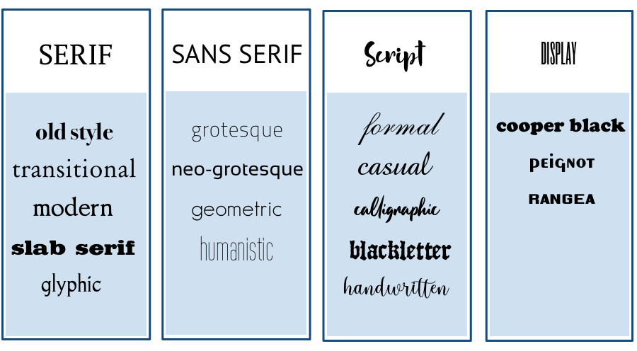
Within the above groups, we can distinguish certain subgroups. There are specific names of fonts in them. This is how it works:
- Comic Sans → script → casual
- Arial → sans serif → grotesque
- Times New Roman → serif → transitional
How to choose the right font for your digital publication?
There’s no perfect answer to this question. The main rule is legibility and aesthetic consistency. The art of design is to adjust the font to the size of the screen on which the publication will be read. Regardless of whether you publish a web magazine displayed on computer screens or a mobile magazine app seen on smartphones, the font should allow reading the text with ease, and provide comfort to the eyes without strain.
Before choosing fonts, study your audience closely: their age and jobs. The fonts should fit readers’ expectations and their lifestyles. Sounds weird? But look – Comic Sans might be perfect for kids or comics fans but not lawyers or academic teachers.
The main rules that should be followed when you choose fonts:
- The top priorities for font choice are legibility and readability.
- Start from selecting fonts that will be used in the body of the article and will be the dominating part of the text.
- Use “safer” fonts for most parts of your text and play with the title or subtitles.
- In most cases, two different fonts in one article are enough.
- If you want to use several fonts, use those of similar height or from the same period, or from the same designer.
- Match the fonts to the content’s character and the preferences of the readers.
- Take into account the screen on which your content will be displayed (computer, iPad, smartphone).
- The font must not distract from the content.
- To single out a piece of content, you can either use bold or italic. Never use underlining, unless it’s a hyperlink.
- Test your design – it is always good to check what the draft looks like in the form it will be published.
Fonts and the way they affect people is also the subject of many scientific studies. For example, they can convey trustworthiness. Readers are more likely to believe the information set in a serif font such as Baskerville than a sans serif font such as Helvetica.
Another analysis shows that serif fonts are seen as more traditional, sans serif fonts more casual, and fixed-width fonts are plain and boring. It was confirmed by researchers saying that font size, stroke thickness, and character spacing can evoke memories and mental images in onlookers. For example, larger font sizes produce a stronger emotional response.
Fonts you can safely use in your digital publications:
- Nunito Sans
- Garamond
- Georgia
- Avenir
- Raleway
- Lato
- Verdana
- Open Sans
- Myriad
- Electra
- Perpetua
- Arial
- Tahoma
- Helvetica
- Proxima Nova
Fonts that we advise you to avoid (or at least use sparingly):
- Comic Sans
- Courier
- Papyrus
- Impact
- Souvenir
- Times New Roman
- Brush Script
How many fonts do you need and how to mix them?
You don’t have to limit yourself to one font, but remember that five is simply too much and this amount will make a text just chaotic instead of pretty. At the beginning, you can play with two, with the principle that you choose one for the main body and the other for the title (or subtitles). Typefaces from the same period are more likely to work well together and if they were created by the same designer, the better for the consistency of the design.
You can mix sans serif and serif fonts, looking for the perfect pairing of them by trial and error. This combination can help you create a nice texture on the content page and set apart different sections of the article. A sans serif and serif mixed between the headings and text usually turn out quite attractive.
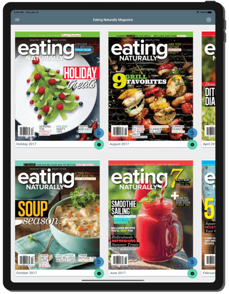
Look at “Eating Naturally Magazine”. They mix different font types together on their cover keeping sans serif for the title. The whole thing catches the eye and gives an effect of professional, refined design.
Sans serif fonts:
- perform better on the web,
- they are easier to read on computer screens because they are less visually complex – reading requires less time to be processed and our brains focus more on the message than trying to decipher the characters,
- they are more legible in small sizes, because of their simple forms,
- they may be a good choice if you want your magazine to exhibit a more liberal or modern design approach.
Serif fonts:
- they are usually preferred in long passages of text because the serifs help the eye travel along the line quicker,
- they are often better for text in charts, graphs, and diagrams,
- usage of serif typefaces on low resolution screens can even cause visual dissonance, discouraging the readers from reading the content,
- they can add variety to the text if they’re not overused.
What font size should you choose?
Properly selected font size improves digital publication readability and allows people to avoid frustration while consuming content on a mobile device.
Too small a text may cause tiredness. As a result, the readers ignore most of the written information. This is especially important for reading on mobile phones where lowercase letters on a small bright screen can cause headaches. On the other hand, too large a text can also cause problems. It’ll be distracting and draw attention to itself too much and not the essence of the words.
- Most experts agree that a 16-point font size is perfect for a text which will be read online. This size in digital corresponds to the typical 10-point size in print. It is not too big and therefore easy to read.
- For a text which will be read on a mobile device, 14-point is the optimal size.
- It is also believed that for iOS devices it is better to use a text that is at least 11 points (it’s legible at a typical viewing distance even without zooming). This is the minimum value of the font size, however, the ideal size for many people lies within the range of 15–19 points.
- For Android, the minimum readable font size is 12 points, but it is strongly recommended to use at least 14 for the main text.
Note that different fonts of the same size can look totally different and give various aesthetic impressions. One font in 12 point size can seem much higher than another in the same size. Despite all the rules, everything should be checked in an individual way before the final publishing.
In different guides, the font sizes are defined in a diverse way. Pixels (px) are not the same as points (pt). You’ll find the appropriate converter here.
Where can you get fonts?
The answer is simple – from the Internet! Oh, God, what would we do without it?! There’s a lot of websites offering free or paid fonts you can just download in various formats (otf., ttf.). Most of them are provided with a font search engine based on different categories like size, popularity, time of origin, etc.
Here’s the list of places that will help you in choosing fonts:
- Google Fonts – a free and easy to use library of 1029 free licensed font families. All fonts are free to use for both commercial and personal purposes.
- 1001 fonts – a site that offers 25128 free fonts in 13669 families, free licenses for commercial use, and easy direct downloads.
- Just My Type – a collection of font pairings from Typekit and H&FJ.
- Fonts In Use – a website that has collected over 17,000 designs, each using at least one of over 12,000 typeface families from more than 3,500 type companies. Great piece of content and a massive source of inspiration.
- Typewolf – a great resource relevant to everything related to typography on the web.
- 50 Examples Of Stunning Typography In Magazine & Book Designs – an article on Bashooka which leads to a lot of design inspiration.
– How can I find the names of fonts I saw somewhere?
There are websites that help with recognizing the font. You only need to upload a picture (screenshot) of a font you like and that’s it. One of those kinds of websites is myfonts.com, try it yourself.
How to use fonts in a PDF file?
You will download fonts (for example from websites listed above) to your computer, not a specific program. They often come in two formats: otf. or ttf. If you need to change the format, you can easily convert one to another – there are tons of programs on the Internet to do it quickly.
After downloading a new font from the website, you have to install it, which is super easy. To install a new font on a Mac, find a downloaded font file, double click the font name to open it in a viewer, then click the install button.

To install a new font on Windows 10, right-click the font file, and then click “install”.
After you’ve installed the new font on your computer, they’ll appear naturally in different programs you have and will be ready to use.
If you use InDesign, the font you installed will then appear in the Font menu on the Character panel.
Remember to embed fonts into your PDF in InDesign.
Embedding fonts is a way to ensure your document is viewed as intended, with no unwanted font changes.
How to embed fonts in InDesign?
- Open your file in InDesign.
- Go to File > Export.
- You’ll see the Export dialog window. Create a file name for your PDF document and select the Format dropdown menu and then select Adobe PDF (Print). Ensure your document is the PDF type, and Save the file.
- You will see the Export Adobe PDF dialog window with a lot of settings, but we are interested only in these related to font embedding. Select Advanced from the left menu.
- You will have access to the Font settings. The settings related to font embedding only have a single value. To ensure that all the fonts in the document are embedded, set it to 0%.
- Then select Export.
- All of your fonts are embedded into the document.
If you have some PDF file on your computer, you can check what fonts have been used in it:
- Open your PDF file.
- Click File> Document Properties.
- Click on the Fonts Tab to display the list of all fonts.
Digital typography connects people
Typography isn’t only just an element of digital magazine design. It’s totally something bigger – a part of communication on the line: publisher-content-reader. Ben Barrett-Forrest, a graphic designer and the author of a video about the history of typography, says: “Type is a power. The power to express words and ideas visually. It’s timeless, but always changing.”
Properly selected fonts and a well-arranged layout have an impact on the first impression of the magazine, the comfort of reading, and the overall perception of the brand. The better it all fits together, the more professional it seems to the reader.
We hope our advice will help you improve your digital typography regardless of the project you work on.
Glossary – a few terms related to typography worth knowing:
- Drop cap – a large capital letter used at the beginning of a paragraph or section, in the past it was a decorative element in old books and manuscripts. Drop caps are an effective way of grabbing readers’ attention also in the digital magazine design. They add personality and visual strength, giving the magazine page a unique look.
- Italic – a slanted version of a typeface (slants from left to right), used for emphasis or for titles.
- Kerning – it’s related to adjusting the spacing between two letters in order to improve appearances.
- Majuscule – a capital letter.
- Miniscule – a lowercase letter.
- Monospaced type – a typeface in which the amount of horizontal space taken up by each character is the same.
- Pixel (px) – is short for “picture element,” i.e. a single dot on a computer screen. If a font is 16 pixels in height, that means it takes up 16 pixels on your screen from the top of the letter, to the bottom.
- Point size (pt) – the smallest unit of measure used for measuring font size; you’ll use it every time you set the text dimension in any writing and editing software; it’s something different than measuring in pixels.
- Serif – a short line or stroke attached to or extending from the open ends of a letterform; also refers to the general category of typefaces that have been designed with this feature. Used for smaller parts of texts to add unique and special feeling.
- Sans-Serif / Sans – name of the fonts types without a line next to the character; the general category of typefaces (or an individual typeface) designed without serifs.
- Tracking – the uniform amount of spacing between characters in a complete section of text (sentence, line, paragraph, page, etc.); used to adjust spacing across a line; often confused with kerning.
- X-height – the lower case letter height measured from the baseline. When you mix fonts, you need to choose typefaces with similar heights. It’ll help you keep a paragraph gray level constant.